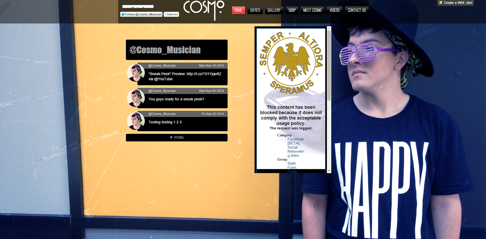
What was good- I really liked the opening page for this website as it opens with various photos of the artist, links to his social media as well as his tour dates which are all vital things fans will be searching for.
What could be better- The merchandise for the singer needs to be worked on as currently it is only filled with an out of focus image of a jumper with no price tag. Apart from that it is a very well rounded and solid website.
What was good- I thought that the inclusion of a social media sidebar was a nice touch as it allows readers to keep up to date with the artist from the get go. As well as this by including their amazing album cover really helps to sell the artist and he's record.
What could be better- There are a few blank pages such as the 'contact us page' and 'meet Cosmo' page which for obvious reasons need to be filled to make it seem like a professional website.
What was good- I liked that they took the time to conduct several separate interviews of all the band members and post it on their website, as well as this their merchandise page is well fleshed out with various different kinds of collectibles.
What could be better- The website could do with a better opening page as although the teaser for the bands video is good it is the only thing making up the opening page a link to their social media might be well placed here. As well as this the 'about me' section does not really contain a great deal of info on any of the artist.
What was good- I liked the sidebar which linked to the artists social media as well as the gallery that the website had which gave various shots of the musicians in different situations.
What could be better- The album page is quite weak on this musicians website as it only has the name of the album whereas a picture of the album would be a lot more appealing.
What was good- I really liked the countdown towards the bands first music video I think it gives the website a great deal of originality. I also thought that the opening page was appealing showing of the bands album cover and so forth.
What could be better- Like other websites merchandise needs to be improved on as well as this a gallery is needed for fans to see their favourite artist as well as the members to advertise themselves.
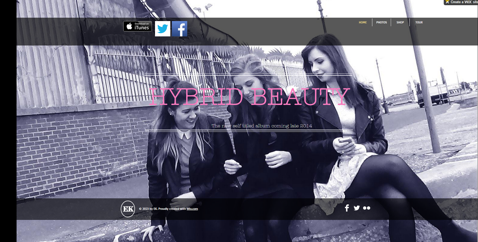
What was good- I liked the image that first appears on screen which is the artist album so the reader is straight away shown who the artist is as well as the album and its availability on iTunes. I think that the gallery is also very well done not to mention the excessive back story of the artist.
What could be better- Obviously the merchandise page needs improving on but apart from that I think its a very well rounded professional website.
What was good- I think that the gallery was very good as it had many photos of the star in several locations, I think the interview with the artist was another nice touch for any fans reading.
What could be better- The front page of the website is a bit bland by putting links or displays to the artist social media would be good. Also things like merchandise need to be added to give the website a professional touch.
What was good- I liked how filled and lively the home page was with tour dates, album info, breaking news and teasers cover it which allows any fans to instantly get what they want from the website.
What could be better- Overall it is a very well done website it could use a few more photos of the star but that's about all.