Final Music Video

Showing posts with label Digipack. Show all posts

Digipack feedback

What people thought went well-
  • love it, it's mine! Done a really good job with the colour, text and the photos are really professional. No improvements needed :)
  • The bottom left sqaure is the best picture out of any on the digipacks. I think the entire thing is very professional and the theme is clear and obvious.
  • Alleyways digipack is my favourite by far. It looks so proessional from the lyrics page to the proffesional layout of the front covered image. There isnt much to improve and i am struggling for things to suggest.
  • I really like Alleyways digipack, introduces the band and the genre at the same time
  • Like the picture of the Group together a lot it is high quality.
  • Alleyways is also one of the top digipaks and needs no words.
  • The alleyways digipak have quite a few images on theirs that make it look over loaded. a lot of the pictures look professinal. You can see that the text works well with the black coloured background. 
  • Good, strong imagery here; the font matches, everything looks great - apart from the images don't totally flow.
  • Great pictures and really like the text. All looks very slick and proffesional and links to the genre. Nothing bad to say really!
  • I think this is possibly the best as it has colour and sticks with the bands themes and has synergy with the other products. It has a lot of good pictures which have been nicely edited to fit the style of the band and the genre.
  • I really cant think of anything to improve on for this i areally like the outcome of the digipack
  • I like the theme and text
  • Theme is good Text is easy to read. Great photographs, professional editing and layout.
  • I love it all and i would improve nothing. perfect.
  • Everything about this digipak is amazing - the colours, the text, the images, the genre AND the overall layout. Improvements: there aren't any, where can I buy it?
Things that we could improve on-

  • Could include more writing on the CD.
  • Not a fan of the bin on fire or CD. The bin picture quality isn't the best, if retaken it might look better. The CD is extremely basic so unless your going for minimalism I suggest soothing more interesting. I also hope that the microphone image isn't the front cover because its more suited to the inside of the CD holder. I personally do not like the silhouette shots maybe keep one and have another band photo in an interesting location.
  • The overall layout is really good some of it is really over loaded but still looks amazing.
  •  Maybe rearrange a few, swap them out to get a better balance! I'd make the font bigger on the front cover as well, apart from that, it's brilliant!
  • A more interesting front cover just a picture of a microphone would not make me want to pick up the album if I saw it in a shop.
  • Hard to tell which is the front and back covers
  • Hard to distinguish between front and back covers etc

Digipac analysis

1. At first glance, which digipak impresses you the most?

Cosmo

2. Take the following into consideration - colour, text, image, genre and overall layout. What do you like about the digipak and what do you think could be improved on Grace Starr's digipak?

Clearly it is not quite finished yet so that obvious needs work. However I do like the front cover photo and the font used.

3. Take the following into consideration - colour, text, image, genre and overall layout. What do you like about the digipak and what do you think could be improved on Encoded digipak?

As the band is are fresh on the music scene by using a negative effect on the artist faces means that they will not be easily recognizable. I do like the font and the background image they used.

4. Take the following into consideration - colour, text, image, genre and overall layout. What do you like about the digipak and what do you think could be improved on Alex Echo's digipak?

I think that the photos used fit the digipak well and its provides useful background images. However it does seem to be unfinished as there is no bar code on the back or record label associated.

5. Take the following into consideration - colour, text, image, genre and overall layout. What do you like about the digipak and what do you think could be improved on Nicholas Alexander's digipak?

I really like the color scheme used throughout the digipak and the iconography of the front cover as Nick looks good sitting on the bridge with the nice font used. However on the song list I don't like the white strip that goes down in contrast to the blue background

6. Take the following into consideration - colour, text, image, genre and overall layout. What do you like about the digipak and what do you think could be improved on Alleyways digipak?

Nothing its perfect

7. Take the following into consideration - colour, text, image, genre and overall layout. What do you like about the digipak and what do you think could be improved on Hybrid Beauty digipak?

I like the photos used and the black and white background of all the sections of the digipak. The compilation of all of the photos on one section is good as it seems like they have been a band for a long time. I don't really like the font that they use as it really blocky and doesn't suit the rest of the digipak

8. Take the following into consideration - colour, text, image, genre and overall layout. What do you like about the digipak and what do you think could be improved on Cosmo's digipak?

I really love Cosmo's digipak as loads of time and effort has gone into making and its a beautifully colorful with great images and amazing backgrounds. There is not much that I don't like about this pac I suppose the 'happy' wording is unnecessary in one of the segments. 

9. Take the following into consideration - colour, text, image, genre and overall layout. What do you like about the digipak and what do you think could be improved on James Couleur's digipak?

The colors that make up the digipak do not fit together very well and look odd together as it goes from rainbow to black and white. It also seems unfinished as things like the bar code and the record label are not present. 

10. Take the following into consideration - colour, text, image, genre and overall layout. What do you like about the digipak and what do you think could be improved on Jaya's digipak?

I really like Jaya's digipak as I think the images are really well taken I also think that the front pages font is really nice as it looks personalized as it seems like her signature. There are some things I would change as the song listed page looks stretched out and off center apart from that its a solid digipak.

Digipac construction


Here is the digipak for our band 'Alleyways'. We all liked and agreed on the idea of linking several different aspects of our band together whilst doing a cross-product consistency task we realized a good look and style for our digipak will be using different pieces of merchandise to make up different our digipak such as our CD cover, our bands poster and the back of our CD as well as our music video all of which follow the same themes and styles such as silhouettes, black & white and the heavy use of fairy lights all of which help to show off our bands image.

DigiPak ideas


After talking about our digipak and how to change it to fit our bands style and image, we decided to adapt a photo we took will rehearsing for the band ad place into bands digipak as can be seen in the bottom right.

The digipak features a plain front cover, a plain back copyright sheet, a CD and a back cover.
The front cover of the digipak will be a dark and silhouetted microphone with a back drop of a white sheet surrounded by fairy lights. We will also have our bands logo in the bottom right of the cover to let people know who's band it is.


Above is the plain black back of the booklet that stands within the left hand side of the CD case. It reads "DIRTY HIT RECORDS. © 2014 Dirty Hit Records. THE COPYRIGHT IN THIS SOUND RECORDING IS OWNED BY DIRTY HIT RECORDS. FULLY LICENSED EXCLUSIVELY IN THE UK."


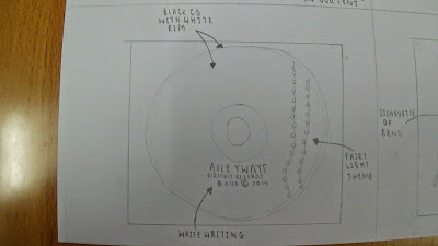
Here is the CD cover that we will use in our digipak it will be a black painted CD with two strips of fairy lights coming down from the top. As well as this it will also have our logo and name posted on the front of the CD so people will know who's disc it is. By pasting the fairy lights on the front of the CD it helps to keep in the theme of bright lights next to a black screen which we have done throughout our digipak.